App Store Rating
4.9★
Up from 3.5 within three months.
Case Study
The Wells Fargo Security Center project was an opportunity to redefine how millions of customers interact with digital security. As Principal Product Designer, I led a cross-functional team through research, strategy, and execution to create one of the app's first fully native experiences—bringing clarity, trust, and usability to a critical part of the customer journey.
As Senior Manager of the Security & Authentication team, I partnered with product managers and developers across multiple business lines, serving as the principal designer and player-coach. I guided junior product designers, content strategists, and visual designers from early definition through launch, ensuring design quality, cohesion, and strategic alignment.
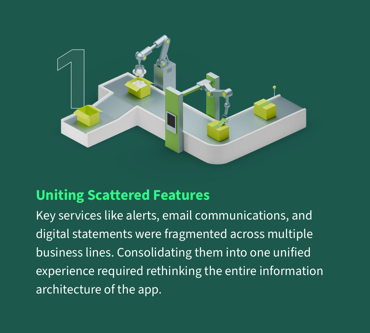
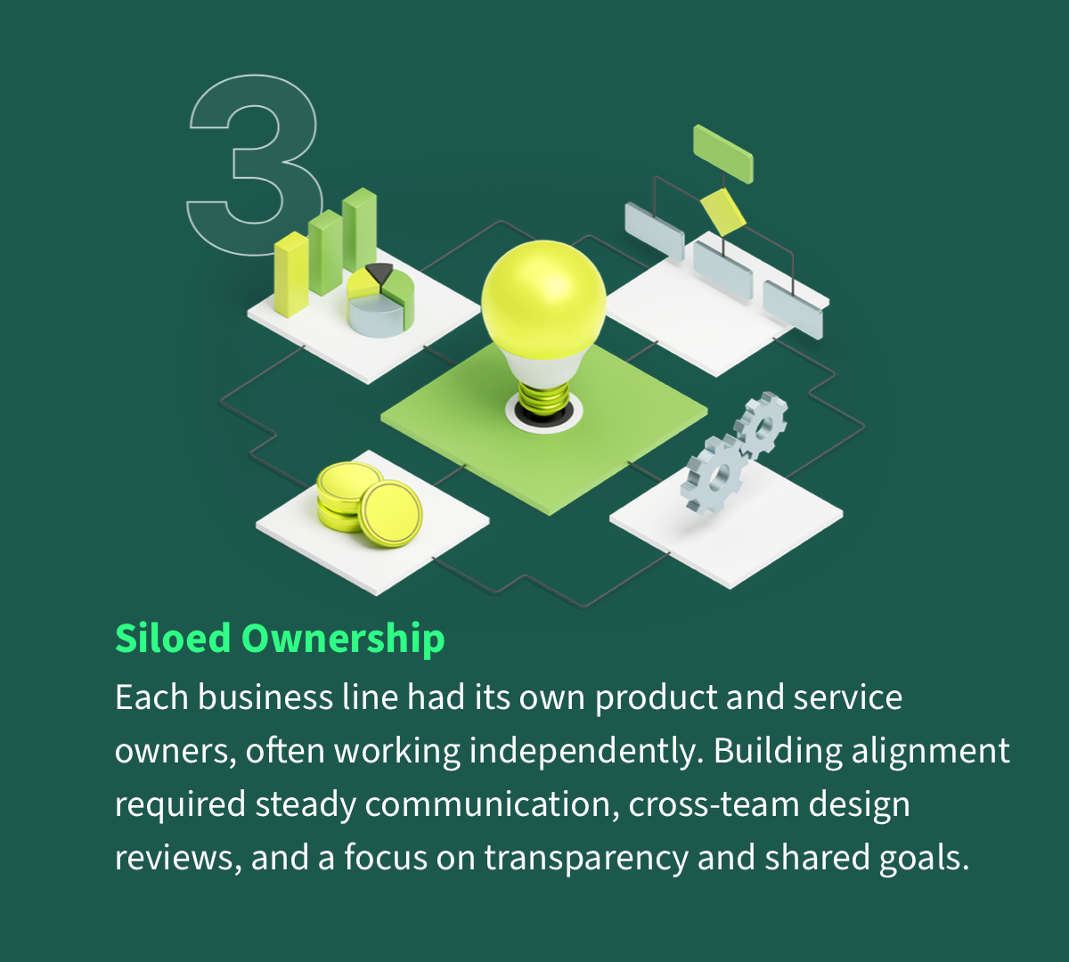
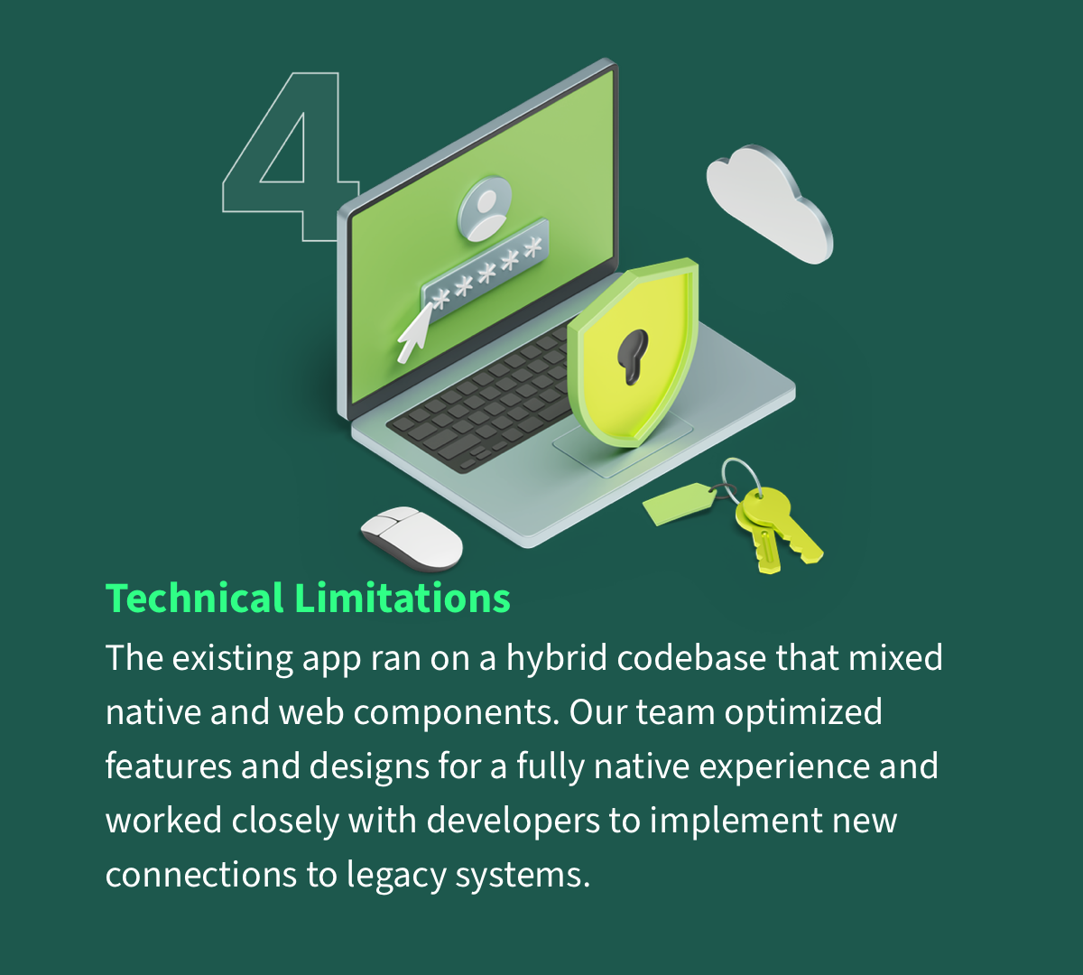
As a key feature in the Wells Fargo mobile app, the Security Center introduced a mix of familiar challenges and a few unique ones. The project demanded both a redesign of legacy systems and a shift in how customers (and the organization) understood security. Early research surfaced four core constraints that shaped our strategy and information architecture.
I collaborated with product managers and UX researchers to explore how customers engaged with existing security features. We planned a six-month research initiative focused on gaps, pain points, and opportunities.
Over a two-month period, we worked with 12 users who captured ideas in personal journals. They reflected on the necessity, usefulness, and longevity of their account security across every touchpoint—branch, ATM, phone, mobile app, and website.
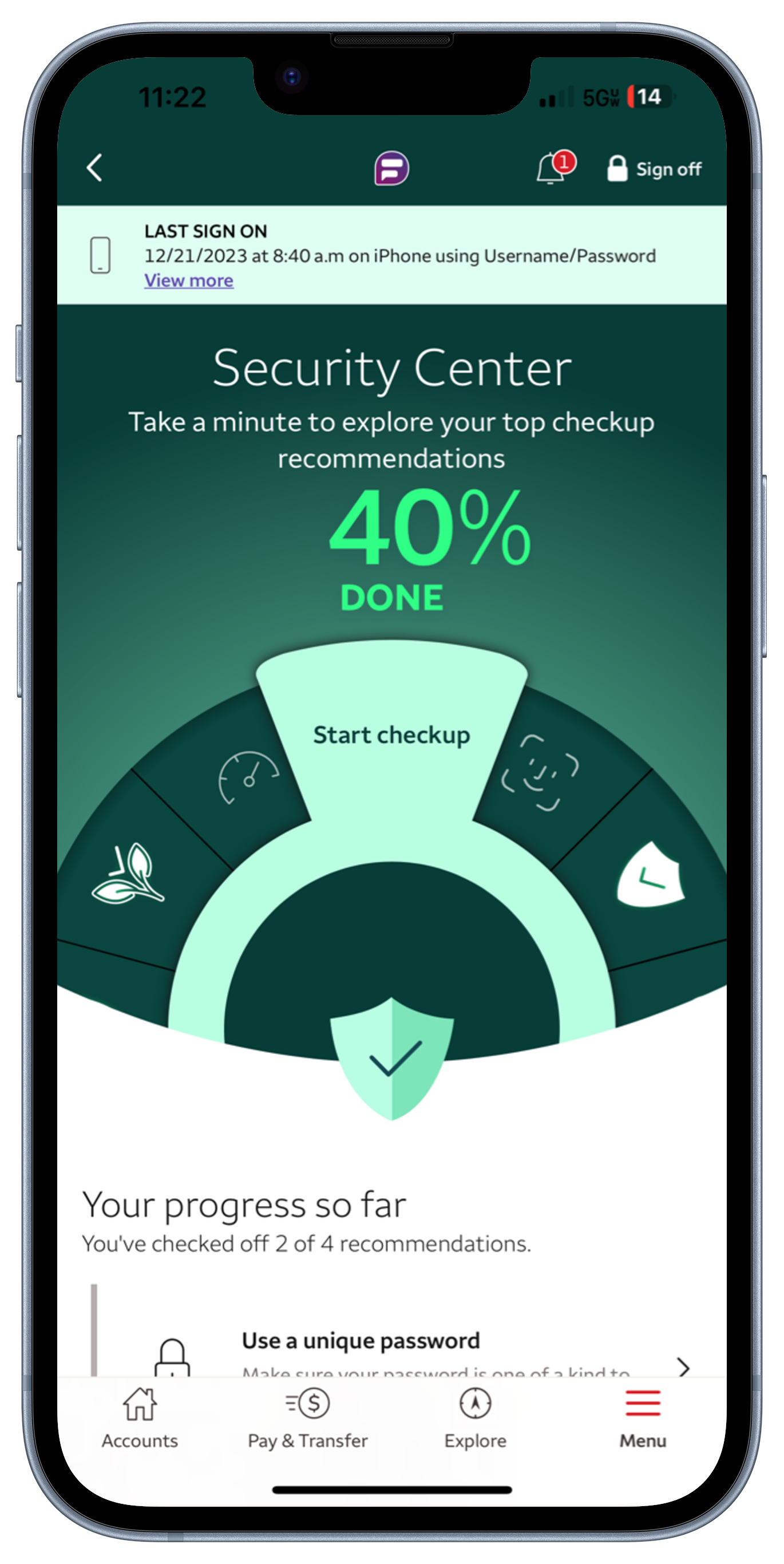
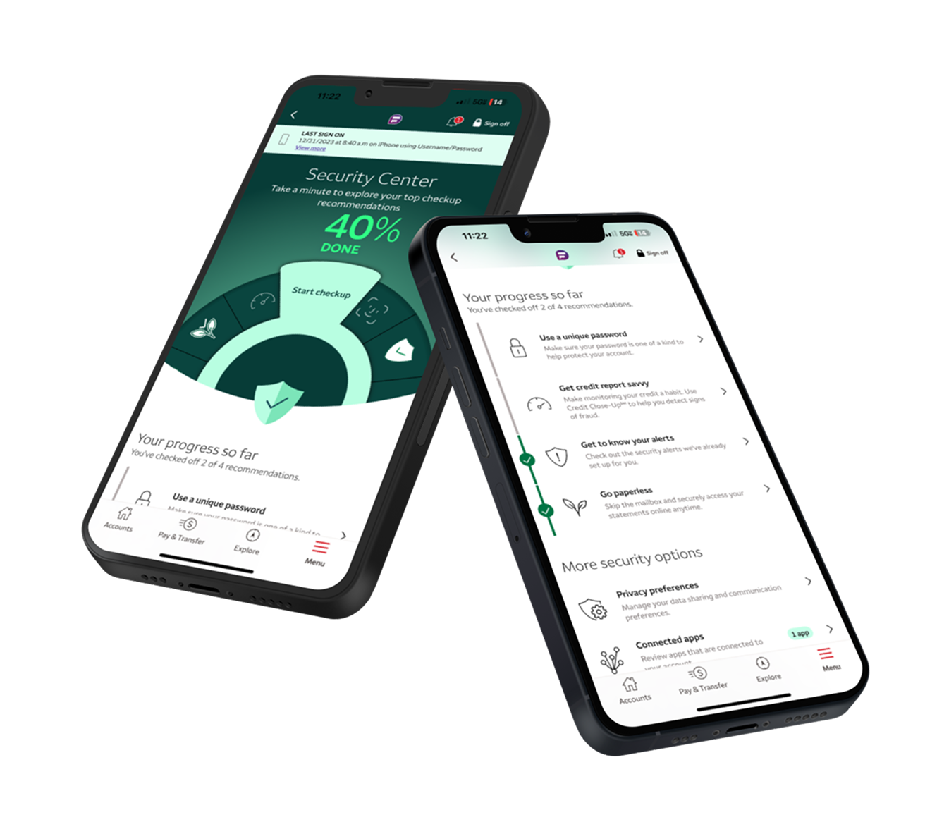
This approach surfaced key insights, including cases where customers requested online features that already existed but were difficult to locate, such as security alerts. These findings directly informed design decisions and highlighted opportunities to improve discoverability and user confidence.
A loop of rapid testing, alignment, and refinement kept the work grounded in both customer needs and technical realities.
We aligned stakeholders on the core security narrative, knowing we’d iterate heavily before landing on the final structure.
We created low-fidelity flows that emphasized content hierarchy and information architecture over visual polish.
Using paper prototypes and interactive mocks, we treated customers like co-designers, looking for the “diamond in the rough.”
As we learned, we folded in new brand components and technical constraints, moving toward a coherent, native design system.
The Security Center improved customer confidence, streamlined support, and contributed to a significantly higher app rating.
App Store Rating
4.9★
Up from 3.5 within three months.
Feature Adoption
+39%
Increase in key security feature usage.
Customer Reach
60M
Customers with access to improved security.
Fraud Calls
−17%
Decrease in fraud-related call volume.